 Osvaldo González
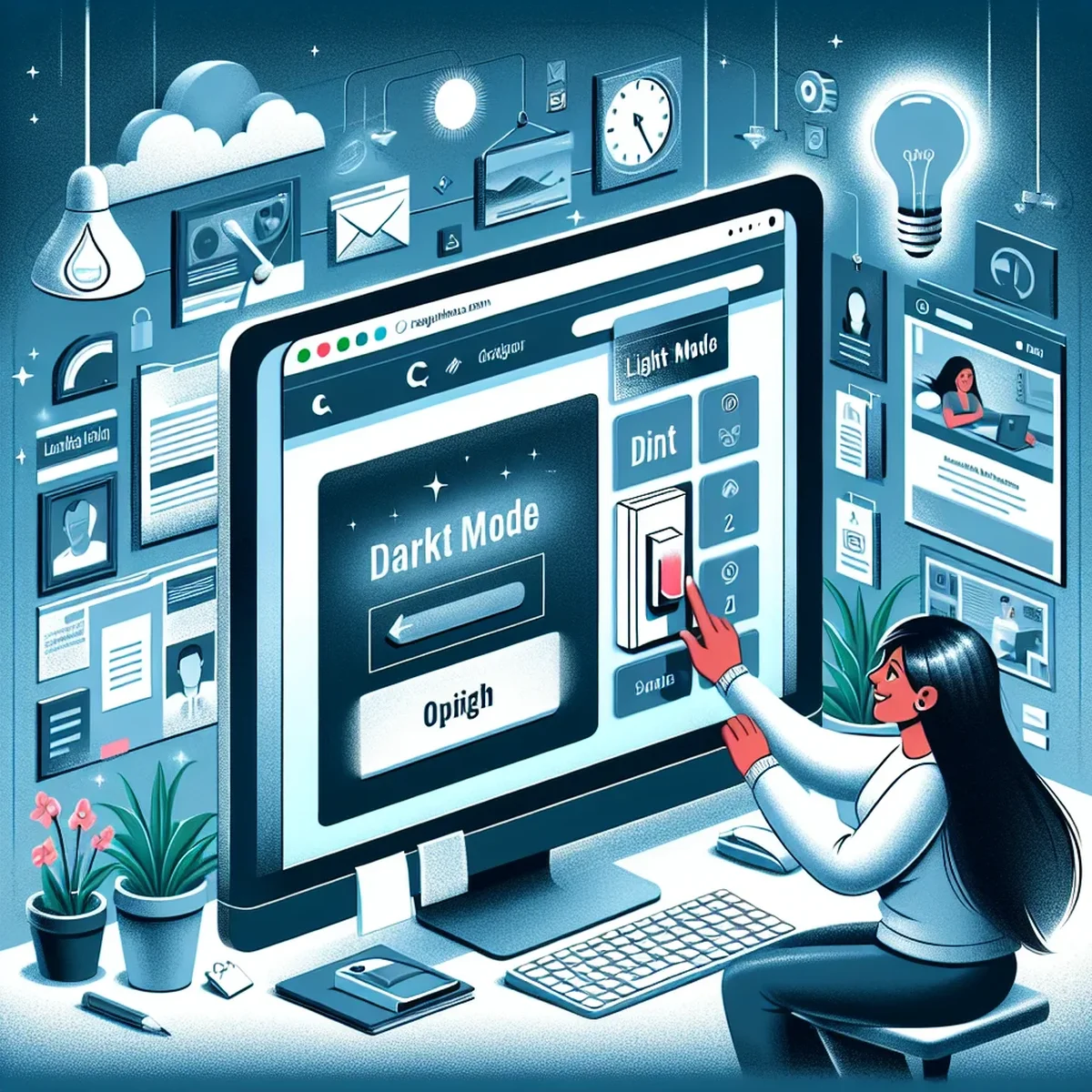
Enhancing User Experience with Dark Mode on Modern Websites
Implementing dark mode on your website isn't just a trend; it's an essential part of modern web design that caters to user preferences and accessibility. With the increasing amount of time users spend on digital platforms, providing a comfortable viewing experience is crucial. Dark mode not only helps with reducing eye strain but also conserves battery life on devices with OLED screens and offers a stylish alternative to the traditional light backgrounds.
The Importance of Dark Mode for User Engagement
Dark mode has been popular among apps and is now becoming an essential feature for websites. It offers a visually appealing experience that can significantly decrease eye fatigue, especially in low-light environments. This feature can lead to increased user engagement as it makes reading and browsing less strenuous on the eyes.
Research and User Preferences
Studies have shown that nearly 82% of users prefer dark mode for most apps and websites for its aesthetic and comfort benefits. Catering to this preference can not only boost user satisfaction but also enhance the time spent on your site.
How to Implement Dark Mode
Implementing dark mode can seem daunting, but it's quite manageable with the right approach. Here are some practical steps you can take:
Using CSS Media Queries
One of the simplest methods to implement dark mode is by utilizing CSS media queries that detect the user’s system theme preferences. Here’s a basic example:
@media (prefers-color-scheme: dark) {
  body {
    background-color: #333;
    color: #fff;
  }
}
This method ensures that your website automatically switches to dark mode if the user has set their device preferences to dark theme.
Adding a Toggle Switch
For greater control, you can provide a toggle switch on your website that allows users to manually switch between dark and light mode. This involves a bit of JavaScript and additional CSS but offers a personalized user experience.
Best Practices for Designing in Dark Mode
When designing your website’s dark mode, consider the following best practices to enhance readability and aesthetic appeal:
- Contrast and Colors: Ensure sufficient contrast between the background and text. Avoid overly bright colors which can be harsh on the eyes in a dark environment.
- Imagery and Icons: Use images and icons that are optimized for dark mode. Ensure they are not too bright and integrate well with the overall dark theme.
- Testing Across Devices: Test the dark mode on various devices and screen sizes to ensure a consistent and responsive experience.
User-Centric Design and Accessibility
Dark mode is more than just a visual preference—it's also an accessibility feature. It helps users with light sensitivity and can prevent eye strain, thus making your website more inclusive.
Compliance and Inclusivity
Ensure your dark mode complies with accessibility standards such as the WCAG (Web Content Accessibility Guidelines). This not only improves usability but also broadens your site’s appeal and reach.
Conclusion
Integrating dark mode into your website design isn’t merely following a trend—it’s about adhering to modern web standards and enhancing user experience. By considering user preferences and accessibility, you can create a site that stands out and keeps visitors coming back.
Implementing dark mode can be a straightforward enhancement that significantly impacts how users interact with your website. Embrace this feature to stay competitive and relevant in the evolving digital landscape.
FAQ
- What are the main benefits of implementing dark mode on a website?
- Dark mode reduces eye strain in low-light conditions, saves battery life on OLED/AMOLED screens, and often improves accessibility for users with certain visual impairments.
- How can I implement dark mode in a responsive design?
- Implement dark mode by using CSS media queries that respect the user’s system preferences or by providing a toggle switch to enable dark mode manually.