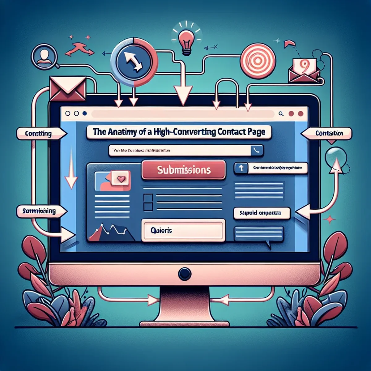
Unlocking the Secrets of a High-Converting Contact Page
Creating a contact page that effectively converts visitors into leads or customers is more of an art than a science. It combines aspects of design, psychology, and marketing to craft a user experience that not only satisfies the visitor’s intent but encourages them to take action. In this post, we'll explore the anatomy of a high-converting contact page, offering actionable insights you can apply to transform yours from functional to phenomenal.
Essential Elements of an Effective Contact Page
Clear Call-to-Action (CTA)
Your contact page should have a singular goal and your call-to-action should align with this. Whether it’s to encourage users to fill out a form, make a phone call, or initiate a chat, the CTA needs to be bold, clear, and impossible to miss.
Simplified Form Fields
Complex forms are a conversion killer. Each additional field can reduce the likelihood of completion. Keep forms simple and straightforward, asking only for essential information like name, email, and a brief message.
Responsive Design
With the majority of internet traffic coming from mobile devices, your contact page must perform flawlessly across all platforms. A responsive design ensures that users have a positive experience no matter how they access your site.
Trust Signals
Include elements that reassure visitors of their privacy and the security of their information. This can be achieved through SSL certificates, privacy policies linked directly from the contact page, and trust badges if applicable.
Strategic Placement and SEO Optimization
Visibility and Accessibility
Your contact page should be easily accessible, with links from the main navigation, footer, or anywhere relevant within your website. This reduces the friction for users trying to get in touch with you.
SEO Best Practices
Utilize SEO strategies by incorporating relevant keywords, optimizing the title and meta descriptions, and ensuring the page loads quickly. These elements help your contact page rank in search engines when potential customers are looking for ways to get in touch.
Common Mistakes to Avoid
Overwhelming Users with Options
While it’s important to provide multiple contact methods, too many options can paralyze rather than empower. Stick to the most effective communication channels for your audience.
Neglecting Aesthetic and Functional Harmony
Your contact page should reflect the overall design of your website. Consistency in design and message reassures users of your professionalism and attention to detail.
Real-world Examples and Best Practices
Look to industry leaders for inspiration. Companies like Apple, HubSpot, and Shopify excel in crafting contact pages that are not only functional but are also optimized for conversions. They employ clean designs, minimal forms, and clear CTAs, all while maintaining high responsiveness and including SEO-friendly elements.
Conclusion
Your contact page is crucial in turning visitors into leads. By focusing on user-friendly design, minimalistic approach, strategic SEO, and clear calls-to-action, you can significantly enhance your conversion rates. Remember, the goal is to make it as easy as possible for users to communicate with you, ensuring a seamless transition from visitor to customer.
By applying these insights, your contact page can go beyond mere functionality and become a powerful tool in your digital marketing arsenal.
FAQ
- What are the key components of a high-converting contact page?
- Essential components include a clear call-to-action, simplified form fields, trust signals, responsive design, and strategic placement of contact options.
- How can SEO principles be applied to optimize a contact page?
- Incorporate SEO by using targeted keywords, optimizing meta tags, ensuring fast load times, and providing clear, concise content that addresses user queries.